You’ve seen them on websites and in emails for years: subtle call-to-action boxes that feature a thin border and text label of the same color with no button fill. These little guys are commonly known as ghost buttons, and they’ve created quite a division in the digital marketing space. Some marketers swear by their effectiveness while others call them poor performers. At emfluence, we like to say that as with most things email, it really depends.
Why Use a Ghost Button?
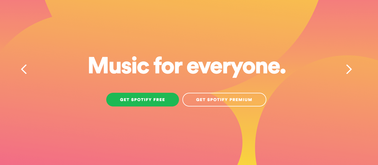
Thanks to a pretty simple design that often blends into the aesthetic of the website or email in question, ghost buttons are a favorite for creating buttons that don’t feel like Big Buttons. You’ve probably seen them working as standalones, as in this example:
Or working in tandem with a solid button, as you saw in this month’s Email Tip of the Month:
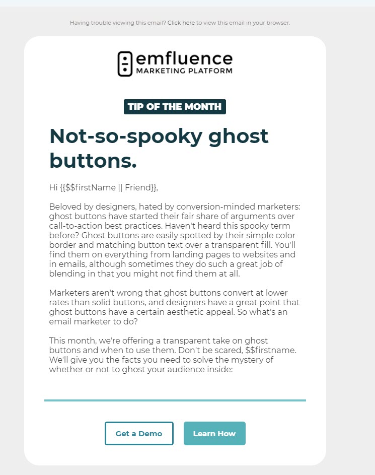
In our experience, if you only have one call-to-action, go with the solid button (years of data and testing show that a standalone solid button will outperform a standalone ghost button). But, if you’re in a bind where you need to incorporate two calls-to-action, layering in a ghost button can be a fantastic way to help your recipients “prioritize” one button over another, like so:
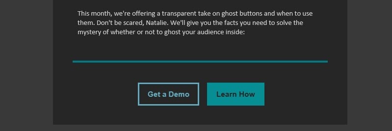
Let’s use the example we sent to you:
In this case, we really wanted you to read the blog post, so we made the button linking you to this blog post the primary, fully solid call-to-action. Because we would also (selfishly) like you to book a demo with us so that we can talk to you about the emfluence Marketing Platform, we included that button but de-prioritized it by making it a ghost button.
In other words, as you think through email design, a ghost button can allow you to add visual hierarchy to a primary call-to-action and a secondary call-to-action. Doing so can increase engagement among not-quite-committed email recipients. For example, you could feature your primary call-to-action as “Get a Demo” and a secondary one as “Learn More,” which would allow people who weren’t ready to talk to a salesperson another way to engage with your brand rather than not engaging at all. And bonus, you can use that engagement to better target them with messaging based on what they’ve told you about their buyer journey.
How to Code a Ghost Button
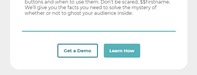
You can use this script here to code a ghost button:
<table align="center" border="0" cellpadding="0" cellspacing="0" class="no-wrap">
  <tbody>
    <tr>
      <td style="padding-right: 10px;">
        <table align="left" border="0" cellpadding="0" cellspacing="0" style="overflow: hidden; border-radius: 5px;">
          <tbody>
            <tr>
              <td align="center" style="background: none; border: 3px solid #2D8498; padding: 11px 19px;">
                <a href="https://more.emfluence.com/marketing-platform-demo" style="font-weight: bold; text-decoration: none; color: #2D8498; font-size: 15px; font-family: 'Montserrat', Arial, Helvetica, sans-serif;" target="_blank">Get a Demo</a>
              </td>
            </tr>
          </tbody>
        </table>
      </td>
      <td style="padding-left: 10px;">
        <table align="left" border="0" cellpadding="0" cellspacing="0" style="overflow: hidden; border-radius: 5px;">
          <tbody>
            <tr>
              <td align="center" style="background: #55b1b8; padding: 14px 19px;">
                <a href="https://emarketingplatform.com/blog/ghost-buttons/" style="font-weight: bold; text-decoration: none; color: #FFFFFF; font-size: 15px; font-family: 'Montserrat', Arial, Helvetica, sans-serif;" target="_blank">Learn How</a>
              </td>
            </tr>
          </tbody>
        </table>
      </td>
    </tr>
  </tbody>
</table>
Other Considerations for Ghost Buttons in Email
Even when used as a secondary call-to-action, there are a few considerations you’ll want to keep in mind with your ghost button design.
First, be sure to preflight your email (you can do this in our marketing automation platform with our free integration to Email on Acid) and check for contrast and rendering—this is especially important because a lack of contrast on your ghost button might render it unreadable or inaccessible to screen reader tools. An easy way to keep this in mind is to keep the design simple—ghost buttons don’t perform well with busy backgrounds, as they are too easily lost in the design. A white background that leverages your brand colors is a good start, but again, preflight to make sure the dark mode renderings have enough contrast as well.
Having more than one call-to-action might make you nervous, and depending on the type of email you’re sending, it probably should. It’s a good idea to run an A/B test on a dual call-to-action like we’re talking about here against a single call-to-action that’s more of a traditional email favorite.
Got another idea you’d like to see us cover in Email Tip of the Month? Let us know in the comments below!