This month’s email tip is brought to you by Anne Tomlin of Emails Y’all. Anne Tomlin is a freelance email developer and the founder of Emails Y’all. Specializing in email development for over a decade, she has worked with such brands as Discovery Inc., NPR, and Brinks Home. Anne is dedicated to coding accessible, responsive emails that render gorgeously in every major client. She runs Emails Y’all based on the principle that everyone deserves an excellent rendering regardless of their chosen client.
In the latest Tip of the Month, we created an interactive email. It uses hotspots to provide useful tips on how to augment the accessibility of your email.
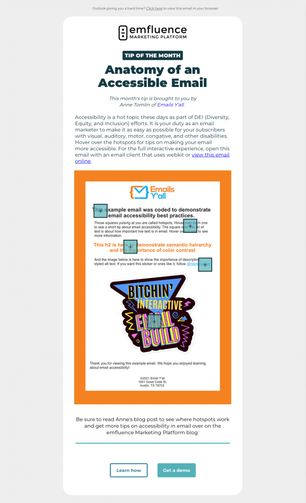
First, let’s take a look at the interactive hotspots, which combine the checkbox hack and a hover effect. When you hover over the hotspot, the value for the checkbox changes to :checked, making the content of the hotspot appear. Hotspots are most commonly used in ecommerce emails; Nike has used them on an image to show different products for sale. You can even have a CTA inside a hotspot so that a subscriber can buy an item right then and there. And since all versions of emails should be accessible, the fallbacks for say, Outlook will still provide an accessible experience:
Now, let’s get to the accessibility tips:
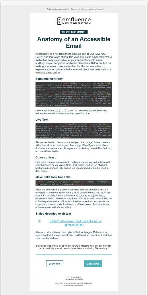
1. Semantic hierarchy
Use header and paragraph tags when structuring your email. These tags inform screen readers of the importance for each line of text. As a result, a screen reader can vocalize the content in the correct order and with the correct emphasis. While it’s fastest to just style the <td> that holds your content, take a few extra minutes to use semantic markup. It will improve your subscribers’ experience and increase your conversion rate.
2. Live text
The most important part of an email, live text ensures that everyone can consume your message without difficulty. Screen readers vocalize only live text, so text within an image won’t be read to your subscriber. Subscribers who use screen readers would receive what is essentially a blank email.
Furthermore, your message won’t be seen by subscribers whose email client blocks images on open — unless they opt to download your images. With email attention spans averaging at 5 to 7 seconds, it’s very possible that they could choose to delete your email rather than download images. The only way to ensure that your message can be received by all is to use live text.
3. Color contrast
High color contrast between your email’s text and background is necessary for your message to be read by people with vision differences. An example of poor color contrast is light-grey text on a white background; those colors blur into each other for everyone, especially older subscribers for whom blues, greens, and lighter colors fade into grey. Dark text on a light background will almost always ensure that your email is legible.
4. Make links look like links
Underlined text always denotes a link. It’s a universal standard known by everyone who has ever used the internet. It’s very common these days to rely on only color and bolding to denote a link. I contend that that’s not enough; links need to look like links for those with color blindness and other vision differences. If your link is differentiated from the text around it by a different color only, anyone who can’t see that color does not know it’s a link.
However, if you use a different color and underline it, any subscriber will know it is a link. Bolded text also denotes importance; so a link with a different color and bolding is still not enough, because those with color blindness will just see bolded text. Simply put, underlining a link is the best way to ensure that its function is understood by everyone who receives your email.
5. Styled descriptive alt text
Subscribers who use screen readers can experience the imagery in your email only through the alt text associated with your images. Because of this, your alt text needs to be specific. “Turn your images on” is not sufficient. Generic alt text tells alt-text users that you didn’t think about them when you built your campaign and, worse, that you don’t care if they can consume it or not.
Alt text needs to be different for each image and relevant to its corresponding image. Alt text needs to be styled for email clients that block images on open; in that circumstance, alt text will be visible, so you want to ensure that your alt text matches your brand guidelines.
We hope you take these accessibility tips to heart and implement them in your campaigns. It is incumbent upon us as email professionals to ensure that all subscribers can consume our messages.
Stay tuned for more tips from Anne by subscribing to our newsletters! In a future Tip of the Month email, we will dive further into hover effects, so if you enjoyed this email, look out for that tutorial.