There’s a good chance you read this headline and said out loud, “one!” And for most email types, you’re probably right—one call-to-action per email is the general recommendation for a reason: it holds your audience’s attention to the singular “thing” you want them to do, which is click to convert on your email.
But sometimes, one call-to-action can have the opposite effect: it can turn off recipients who would like to do something, but not necessarily that thing (or at least not yet). For example, let’s say you’re running a marketing qualified lead conversion campaign. You want these early funnel leads to request a meeting with a sales team member, but they’re pretty early in their engagement with your brand and they might not be ready to have a full meeting right now. If your only call-to-action is “book a meeting,” your conversion rate could suffer. Maybe that’s okay with you, but if part of your goal (say, your secondary KPI) is to educate them on who you are and what you do so that when they are ready to convert they will, you might want to add a secondary, less emphasized call-to-action that supports a “learn more” directive.
Deciding when to add multiple calls-to-action or keeping things simple with just one often boils down to what’s your desired outcome with each type of email in your strategy box. Even if you’re only using one call-to-action, just a few tweaks to how you’re positioning the ask can have a big impact on conversions. Let’s take a look at considerations for your call-to-action strategy:
Call-to-Action Placement
Where you place your call-to-action (or calls-to-action) can significantly impact the number of conversions you’ll see in an email—bury it too much, and you’ll run the risk that people will miss it altogether. Place it too prominently above the value text, and people might get turned off too quickly.
In general, your email layout should follow the visual funnel:
This type of call-to-action placement is great for image-based emails, where you can feature the header image to drive your recipients’ viewing patterns to the button at the bottom of the funnel. It works well for two calls-to-action as well, so if you wanted to offer a “book a demo” and a softer “learn more” CTA, you could use ghost buttons (ones that are outlined rather than filled in) to visually downplay the less important of the two, like so:
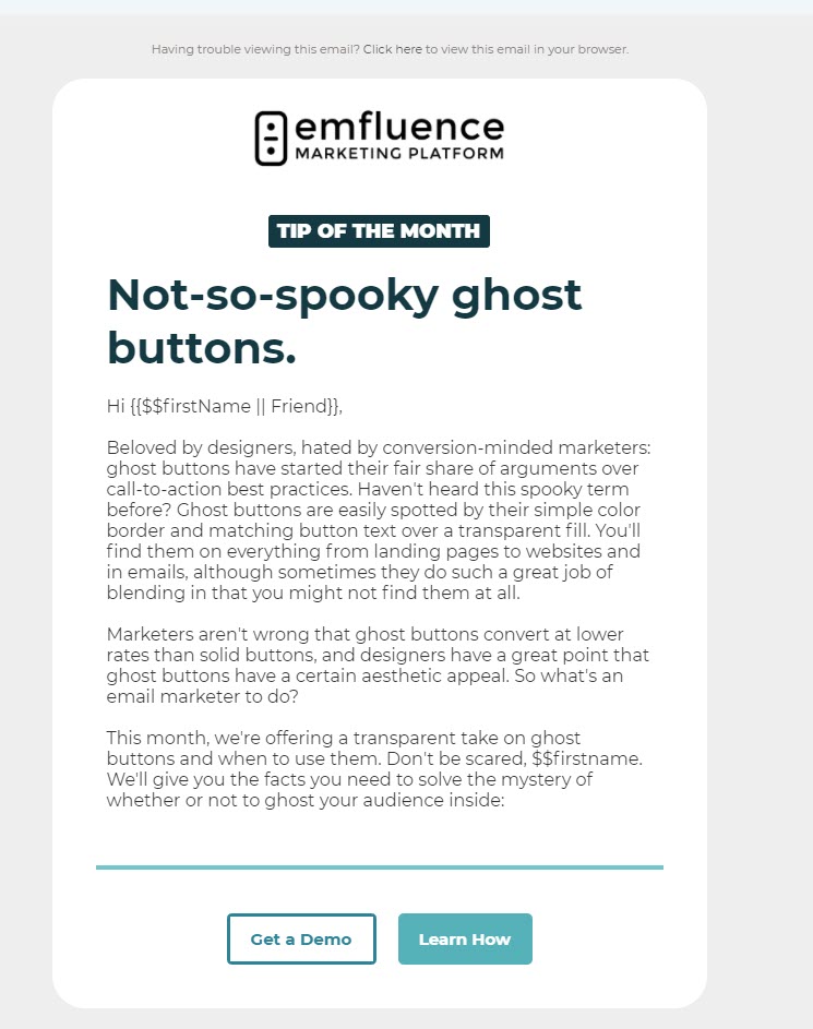
Two calls-to-action can work great when you’re not sure how far along someone is in the funnel (think marketing qualified leads, for example). Your primary CTA is “take desired action,” but the secondary CTA can be used to nurture the lead along if they aren’t quite ready to take a big step. Smaller steps forward will often lead to your desired action in the long run, which is why we’ve deemphasized our “Get a Demo” on the MQL qualifier above–at this point in the funnel, our primary KPI is getting each recipient familiar enough with us and what we do that they will consider us when they are ready to search for a marketing automation platform.
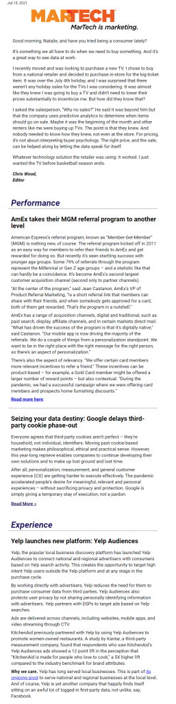
Multiple calls-to-action work well in newsletters, however, where you might have several items worthy of clicking on and a relatively low commitment you’re asking for. In this case, you might use a layout that clearly identifies what type of content can be found where, or you might choose to hyperlink text as part of a narrative, like MarTech Today does:
There is some evidence that text-based calls-to-action perform better than button calls-to-action, but I wouldn’t switch my strategy without a good deal of A/B testing first. In my opinion, recipients are accustomed to buttons in visually oriented emails that are clearly from a marketing team—text-based emails that look like they are sent from an individual (say, an editor or a salesperson) would be the type of email where I would hyperlink text. Both types can play an important role in your overall email strategy, and I wouldn’t personally recommend choosing a strategy that’s 100% visually oriented or 100% text-based.
And what about where you place the call-to-action? Above or below the fold? To me, this depends on how valuable your email copy is. Yes, of course I want you to “buy now,” but if you don’t have any context as to why you’re buying or what you’re buying, then you won’t click through. The same logic applies in a newsletter—give me some background and context as to why I want to go through the trouble of clicking through to your article. Sure, you can have too much text (or images), but in general, most people are willing to scroll a reasonable amount if the content you’ve created to reference your call-to-action is relevant, engaging, concise, and enticing.
One final note about image-based CTAs: it’s a good idea to link your images (and use alt text) in conjunction with your “official” button or text-based CTA but be sure you’re not using an image as your primary CTA. Many inboxes don’t have images turned on by default (especially if you’re B2B), plus an image might not provide clear enough direction as to what, exactly, you want the recipient to do. Which leads us to…
Call-to-Action Copy
A good rule of thumb is that your call-to-action copy should answer the question, “I want to…” followed by the desired action in your actual button. This also means you need to have a clear idea of what you want people to do when they receive your email. That’s not always as easy as it seems. If you ask for a hard sell (e.g., “Subscribe & Save” versus “View Subscription Options” or “Book a Meeting” rather than “See If We’re a Fit”), you could run the risk of scaring off leads who are not sure if they’re quite ready for a commitment.
Color is another important consideration—too many colors could be visually confusing, and what colors you pick can also indicate priority of buttons. For example, a muted color might deprioritize a certain call-to-action whereas a more vibrant color could create a visual hierarchy of importance.
Accessibility matters in how you present your calls-to-action as well. Be sure to test that your color choice isn’t difficult to read (contrast is important when considering the visual accessibility of your emails), and keep your buttons at least 44 by 44 pixels in size.
Your Audience Matters
Your audience is unique and what works for one brand might not work for yours. This is why A/B testing is so important—it can help you identify what types of buttons, styles, or colors are most enticing to your specific audience. Some things to test might be:
- Button or text CTAs
- Multiple vs. singular
- Button color
- CTA verbiage
- Placement
Remember your job is even harder if you’re marketing considered purchase B2C or B2B products/services, where often the conversion on an email is just the first step on the buyer journey. Be sure you have the appropriate ROI assigned to the category of email you’re working on and keep up the testing!