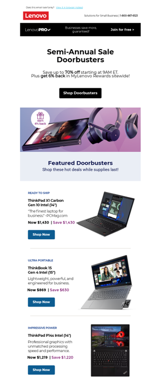
As marketers, we’re always looking for ways to enhance our emails — from experimenting with cool designs and layouts to integrating interesting graphics or widgets. No matter what creative tricks you have up your sleeve, one point to always take into consideration is accessibility. There’s no reason why your content can’t be enjoyed by everyone. After all, if you’re excited about sharing that hilarious GIF, your subscriber would probably get a laugh out of it too.
Accessibility is a large topic to tackle with multiple areas to dive into but to get you started, we’ll begin by touching on the basics of email accessibility.
What is Email Accessibility?
Accessibility has quickly become the top-of-mind priority for marketers because it’s instrumental to user experience and good design thinking. Email accessibility means that you are making sure everyone, regardless of ability or situation, is able to read and understand your emails.
This can apply in all sorts of ways. It may be that your subscriber needs a screen reader to tell them what’s in the content or requires captions to understand a video. It could also be someone who is stuck somewhere with low internet connection or even in a place where they aren’t able to play audio out loud.
Why does all of this matter? Billions of people all over the world live with some sort of disability and there are lots more out there who may experience a temporary disability whether they’ve lost their glasses or are standing in bright sunlight. It’s never a good idea to alienate users and ignoring accessibility in favor of cool designs or due to limited time creates a poor experience for whoever is on the other side of your messaging.
As marketers, we have the power to make accessibility the core of everything we do. It’s a better email experience for your readers while also helping you reach a larger audience and build a compassionate reputation for your brand.
Accessibility Best Practices
While the ADA requires businesses to be accessible to all customers, there isn’t exactly a guide that breaks down how your emails should be written. A good resource to reference for this is the Web Content Accessibility Guidelines (WCAG) published by the World Wide Web Consortium (W3C). These standards cover everything from how to write links to design color choices. What are some of the takeaways from this guide? We’ll touch on all the best practices below to help you summarize!
Utilize Text and Media
While you may have an entire layout of beautiful photos, fun GIFs, and creative videos planned out for your emails, we always recommend a healthy amount of text to balance them out. There are multiple reasons why text and media should be used together rather than solely depending on one or the other.
For one, some email providers have images turned off by default which means your email may come off looking like a blank page. In addition, think about the alternative text that would need to be paired with the images. It’s not an ideal situation because an entire email of images can’t be properly described with alt text.

Design Copy Thoughtfully
There’s a lot to account for when you’re laying out text on your emails. Some points to keep in mind include:
- Use left-aligned copy in your emails to make it easier for those with disabilities to follow the flow of your copy.
- Stay away from fonts that make it difficult to read the text. The best options are ones that are well-spaced out like a Sans-Serif font as opposed to a Script.
- Pay attention to your call-to-actions. “Click here” may be an easy go-to when you’re building out links and buttons, but it can be very ambiguous to a screen reader. Instead, go with something more specific like “Read our latest whitepaper on accessibility”.

Conscious Email Colors
There are plenty of cool trends out there and endless design options but not all are inclusive of those with visual impairments. Having enough contrast between the background and foreground color is a key consideration when designing your emails. Light text on a light background or dark text on a dark background can be difficult to read.
When it comes to color design, think higher contrast. The WCAG recommends a contrast ratio of at least 4.5:1 and at least 3:1 with larger fonts (23px or 18px for bold text).

Properly Spaced-Out Emails
You always want to leave enough white space in your emails so there is room to breathe. When texts, images, and other content get too close, it starts to look and feel crowded. This not only makes it difficult for those who are scanning your email to compartmentalize and understand information, it can also be a deterrent to screen readers and other assistive tools. Those with disabilities using these tools may have a hard time accessing each of the elements in your email if they’re all squished together.

Design for All Screens
Designing emails for everyone also means accounting for everyone’s screens. There are plenty of ways to access emails whether that’s on a laptop, a desktop computer, tablet, or on a phone. Have you ever received an email that you had to scroll left and right through on your phone in order to see all the information? That becomes a pain to read and doesn’t do a great job of making the email user excited about your content.
Remember to take into consideration all of the different screen sizes and design your emails so that they are responsive to whatever your email list may be interacting with you on.
Alt Text
You’ll see this point in every article you read on internet accessibility. Alternative text is so important when it comes to content and has quickly become a staple best practice. This is text attached to an image that helps people understand what the image is without necessarily having to see it. This is useful when email clients have images turned off by default and is the only way screen readers are able to translate what’s being shown to those who have visual impairments.
When creating alt text, keep the following in mind:
- Be descriptive. Instead of “a parked truck”, say something like “a red pickup truck parked in the garage of a two-story house”.
- It’s not necessary to start every description with “image of” or “picture of”. Just jump straight into it!
- Alt text isn’t needed for decorative images. This could be page dividers or brand graphics which don’t lend to the overall storytelling.
- If there is text in the image, remember to include it in your alt text!
The Takeaway
Taking the proper accessibility measures helps you and your email readers out. We all know the amount of effort you put into creating your campaigns and messages. It only makes sense to optimize them for accessibility not only because it’s always good to be inclusive but because it ensures that your hard work is seen by anyone who is interested.
If you’re just getting started, it can be a lot to keep track of. Start by keeping a checklist on hand that you can go through each time you review a newly built email. Pretty soon, this will all become second nature. And if you’re not completely sure how something will come across, there are tons of ideas out there that can help you out, for example, running your content through a screen reader so you can personally see how it turns out.
At the end of the day, the goal is to make emails available to everyone. It may take a bit of learning and practice, but we can assure you that it is always worth it to take the initiative.


