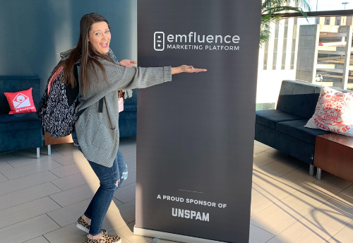
 Well… Unspam 2020, you sure didn’t disappoint!
A full two days of all things email marketing, in the beautiful city of Greenville, South Carolina. What could be better!?
While I would LOVE to go in depth on everything that I learned while at the conference, unfortunately that’s not what I am going to do. Instead, I am going to focus on my favorite session, that was led by Cristina Gomez (@ohcristina) of Tattly. Her session was all about the top email design trends she sees in 2020. However, let me caveat this blog post by saying that I am not going to give you guys all of her top email design trends, because that feels a little like stealing. Instead, I am going to give you the handful that I found particularly interesting and unique (although, I loved them all!). You’ll have to ask Cristina if you’re curious about what the other design trends are that I don’t list here! Alright, let’s get into it.
Design Trend #1: Wiggly Blobs
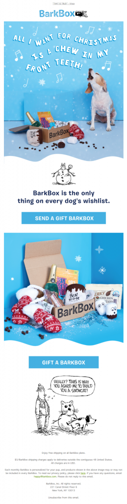
Wiggly blobs can be used as the new section breaks. Instead of using a straight, clean-cut line to break up the sections in your email, why not try a wiggly blob? Pay attention and you’ll start seeing this trend from your favorite brands, like BarkBox.
Design Trend #2: Beige is the New White
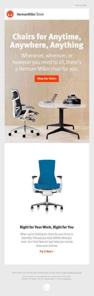
Want to spice up a current email you have but don’t have time to redesign the whole email? Swap out your old white background for something more neutral, like beige or tan. According to @ohcristina, this a modern and clean email design trend that works well with a lot of other colors. HermanMiller Store applies this technique by using a neutral color as the background of their main image in their email.
Design Trend #3: Night Mode
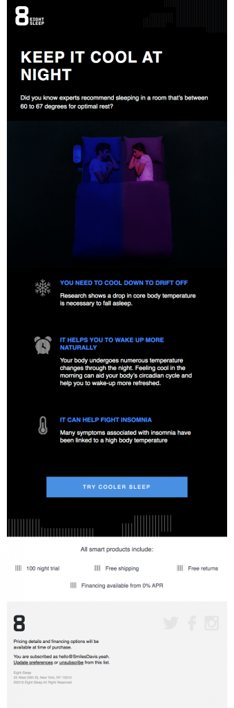
Now that we talked about using some neutral colors, let’s talk about using some dark colors. As email marketers, I think we stray away from going too dark with our emails, but you’ll notice a trend that is becoming more and more prevalent, especially as dark mode or night mode on cell phones becomes a more widely used featured. Don’t be scared to use some black, navy or dark green backgrounds for your emails. It can really help your content pop to your audience. Eight Sleep does a stellar job at utilizing a dark background to really make their imagery and copy standout! You can also read our blog here on how to code your emails for night mode.
Now, last but not least….
Design Trend #4: Plant Accents
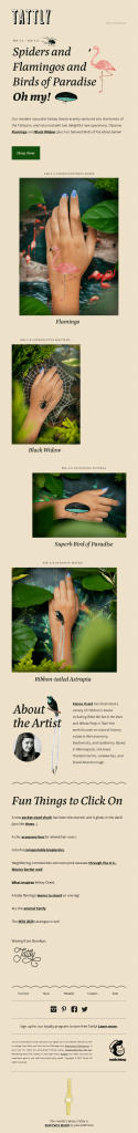
Plants make people happy, right? At least that is the thought behind this next design trend that @ohcristina shared. Plants and greenery are a quirky way to spruce up your email design (see what I did there? J) This trend is a little more on the wild side and might not align with certain brands guidelines, however, Tattly pulls off the look pretty well by incorporating greenery into their actual images. This same effect can be achieved by adding in plant illustrations to the email design – no need to have live (or fake) plants on deck!
Did you also notice the beigey background color? Two design trends in one email – double the fun!
Now that you have some new inspiration thanks to Unspam and @ohcristina, go out and get your email design pants on. Try to find how you can implement one of these email design trends in your day-to-day emails!