If you’re like most marketers, the holidays are a major period where you’re hoping to up your email marketing strategy in order to make the most of the holiday season. This is one of the busiest times of the year for everyone, whether you’re selling a service or product or looking to buy. It’s also the time of year when marketing efforts reach an all-time high to cater to the demands of consumers and meet end of year goals.
Emails are the tried-and-true method of looping customers and clients in on all the opportunities and deals your company is offering this time of year. This is why many of us look to redesign our emails so that they pop. However, we’re here to lessen the load for you — you do not need a complete revamp to get a good holiday email out. Here’s how to update your email templates for the upcoming season of cheer without too much extra work.
Holiday Email Design
Holiday email design doesn’t have to be tricky. Should you blast your readers with tons of holiday colors and pictures of reindeer and presents? Does everything need to be over the top and decked out to make it seem like you’re properly honoring the season? We’ll tackle all that and more with useful holiday email examples so you can become a pro at executing your holiday marketing.
How to Write a Happy Holidays Email (with examples, of course!)
One of the first rules (well, suggestions) that we like to stick to is that your audience should be able to tell it’s a holiday email and specifically which season is being celebrated. A quick glance should be enough to bring about the flood of emotions and memories that they associate with a holiday whether it’s Valentine’s Day, Fourth of July, Thanksgiving, or the whole lineup of winter holidays.
This doesn’t have to be an entire process or a design element that changes with each email. You can create a holiday themed banner to include in all promotions and communications for each holiday you’re trying to feature. Another idea involves sticking to a specific color palette like oranges and blacks for Halloween or greens and reds for Christmas. This makes it easy for people to distinguish without a ton of work on your end. Just check out how these companies did!
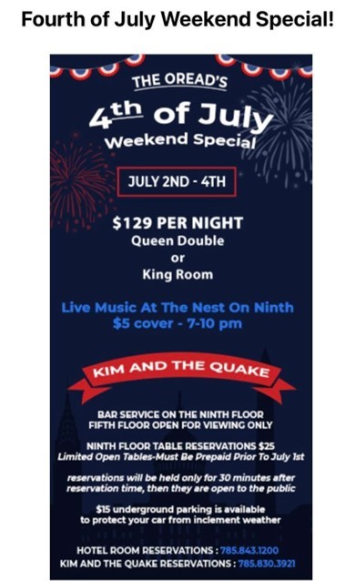
What’s the Fourth without some fireworks? The Oread featured simple clipart and lots of patriotic colors in their email announcing their Fourth of July Special.
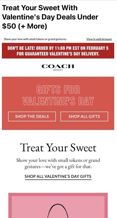
There are no hearts on this email, but you can still tell it’s meant to celebrate the sweet holiday of Valentine’s Day. Some straightforward copy and shades of pink was all it took to get the message across in this Coach email.
Another tip to remember while creating your templates: keep the deal front and center when designing your emails. There’s a lot going on during the holidays and throughout holiday communication that can get lost in the chaos. While your emails may look beautiful, people are interested in your promotions so be sure that information is quick and easy to find.
Also, if you have specific offerings or deals that give you a competitive advantage, make sure your emails showcase that. There’s probably a lot that you already offer to your customer that they will find valuable from free shipping and returns to price matching, same-day or curbside pickup, or extended return policies.
Take a look at these next two email examples that highlight nice offers that the companies offered.
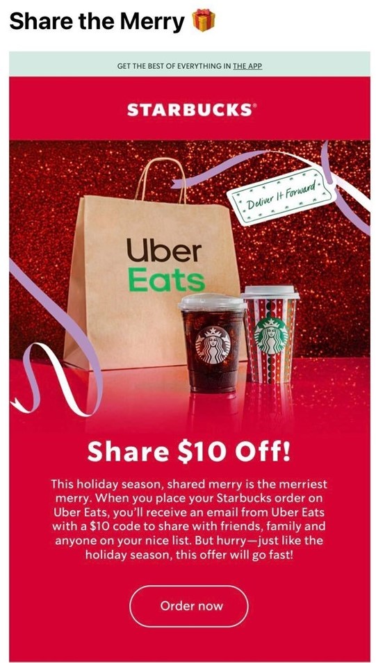
Starbucks and Uber Eats partnered up to create a deal to spread the cheer. Any Starbucks order placed on the Uber Eats app received a shareable code to gift to someone else — a great incentive to treat yourself and a loved one.
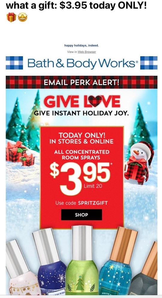
This Bath & Body Works email has the same idea by keeping its current deal right at the center of attention. This is a brand that rotates deals on their products a lot throughout the year. One week, candles may be on sale and the next, you’ll find the best discounts on body care. Loyal customers know that and are looking out for these deals based on what they need.
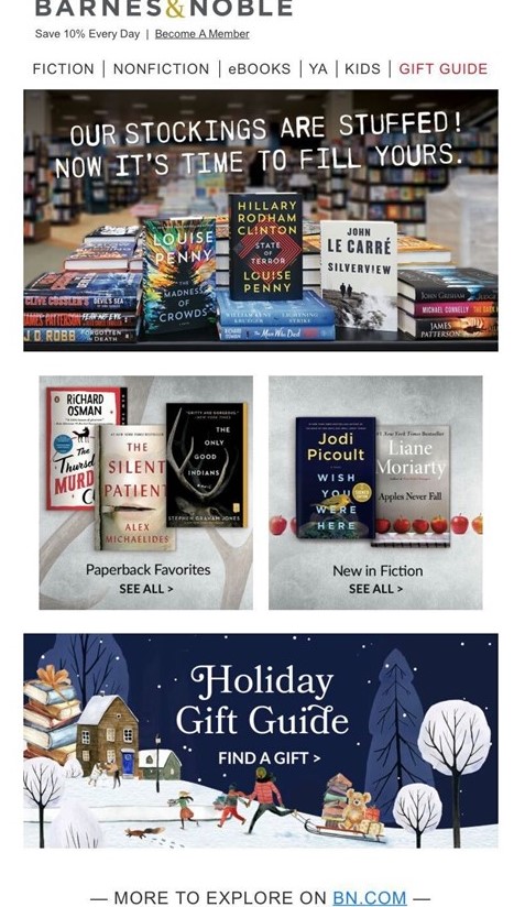
A great tip that lets you make the most of what you already have on hand? We recommend creating a section that links to a holiday guide. This is something that can easily be inserted into emails throughout the entire season starting from October and running all the way through the end of the year.
Including this into emails regularly makes it easier for you and your email list. It also means you only have to design the email element once. And for your list? They already know and expect this useful guide to be there in each message, making it easy to find and reference.
You can also consider editing your navigation bar during the holiday season to include anything helpful such as a gift guide, holiday bestsellers, or current sales.
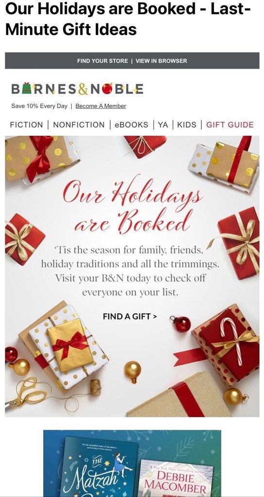
Barnes & Noble employs this tactic by including their holiday gift guide as a regular in their email correspondence. People always know where to look and it saves on creating customized graphics each time. They’ve also made it easier by including their gift guide (appropriately highlighted in a festive red) in their navigation bar.
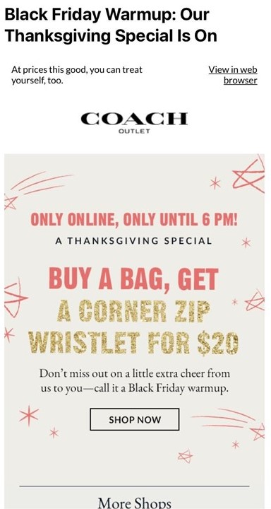
Text goes a long way. You don’t need the most skilled graphic designers to create a classic piece of holiday messaging. Words can get the message across just as easily while also saving you time. Layer them over a picture of your product or a nice stock photo, or even let them stand on their own. You’ll be surprised at what you come up with when you get creative.
No pictures show up in this Coach email but it’s still just as eye-catching. The important information is bold, colorful, and easy to read. You don’t even realize there’s not a picture there to add to the holiday spirit.
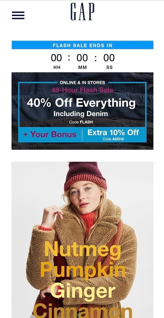
This GAP email worked along the same line. All it took was clever wording and some creativity to create this Fall aesthetic. The picture was likely already done as part of a product campaign shoot. Whoever was behind this email just had to overlay some cozy words in various shades of Fall leaf colors to create the vibe!
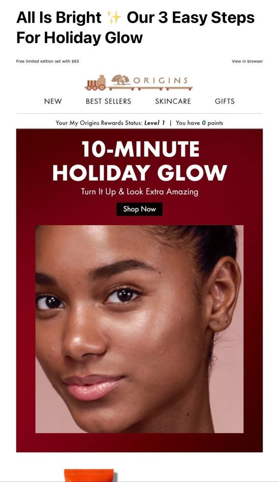
A change in your logo may be enough to give readers that touch of holiday cheer. This is another aspect of an email that only needs to be designed once and can take you through the holiday season. It’s fun to see at the top of any email and is a great way to show your list that you are ready to ring in the season. Take a look at the creative ways these two companies altered their logos for the holidays.
Origins switched up their logo by incorporating gold and red in the form of a cute holiday train.
Barnes & Noble also incorporated touches of the holiday season into their logo by replacing a few letters with iconic holiday images like ornaments and presents!
The Takeaway
The holidays have a way of bringing joy to people in the simplest of ways. Whether you’re adding a touch of color or a warm fireplace GIF to your email, your readers will surely experience the holiday cheer you intend to spread. Hopefully the point has come across that you don’t need crazy design skills to pull off some great holiday emails. All it takes is crafting a template that is useful for your reader while also engaging them.


