Emails are one of the most effective ways for nurturing your leads and have been shown to generate one of the highest ROIs among marketing channels. So, what happens after you’ve taken the time to map out a high-level nurture, designed the coolest layouts, and sent them off to your list? You dive back in to improve results through email marketing optimization.
Email Marketing Optimization
While going through your past email campaigns and nurtures can be time consuming, we highly recommend it. Small changes here and there can have a big impact on conversion rates. Tons of emails get sent on a daily basis so it can be easy for yours to get lost in the mix. If you notice something isn’t performing as well as it used to or if you’re up for more tweaking and testing, carve out some time to update your content with some of our recommended optimizations:
1. Subject Line Testing
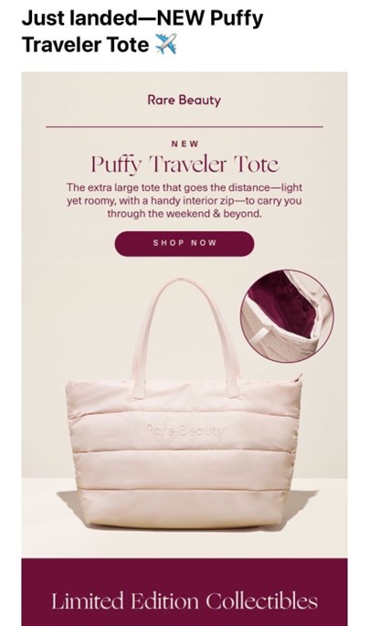
Subject lines are the first things your readers see which is why it makes a lot of sense to start your optimization efforts there. There’s a small amount of space to convey a lot so making the most of your word choice is important. An enticing subject line will get your readers interested enough to open an email and browse its contents.
Subject line crafting is an art and what works for some, may not work for others. Try out different tactics to see what works for your company. This could be personalization, creating a sense of urgency, or using actionable language to encourage an open. You can also take the time to A/B test your email subject lines with a smaller group of subscribers before you blast it to your entire list.
2. Refine Your CTAs
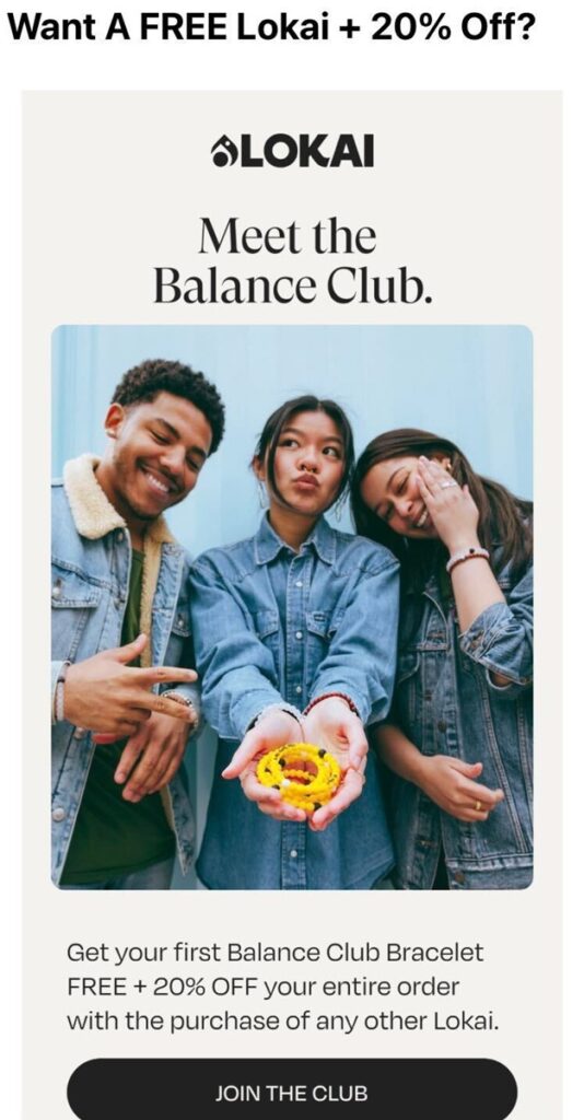
Each of your emails has a goal whether that’s to encourage a website conversion, a download, a follow, etc. While your subscribers may have a general idea of what you’re wanting them to do, it never hurts to make it obvious with clearly stated CTAs. Take the time to consider your action words and whether they entice your readers and create a sense of urgency. Does the sale end soon? Communicate that. Is the event sign-up opening soon? Let readers know to reserve their spot.
In addition, when it comes to CTAs, consider the placement on your emails. You want to make sure to stay above the fold which means including it in the upper half of your message. This makes it easy to see right off the bat. You can then add additional CTAs throughout the email, so they don’t need to scroll back up.
3. Ensure Mobile Friendliness
Many emails aren’t read on desktops and, instead, read on our mobile devices. Cell phones make checking messages quick and convenient. But it also means that email marketers need to account for different devices. You don’t want to design a beautiful email on your desktop only to find that it looks uneven or broken when viewed on a phone. This can make it really easy for you to miss out on conversion opportunities. Double check that your content is mobile-optimized and well formatted before you hit send.
4. Don’t Slack on Copy
While images are important to email to keep them interesting and fun, remember that words play an important role too. Copy helps set the tone and can affect your subscribers’ response to what they’re seeing. Formal copy shows your audience how serious something is while playful and energy-filled copy can help hype what you’re promoting.
5. Create an Easy Out
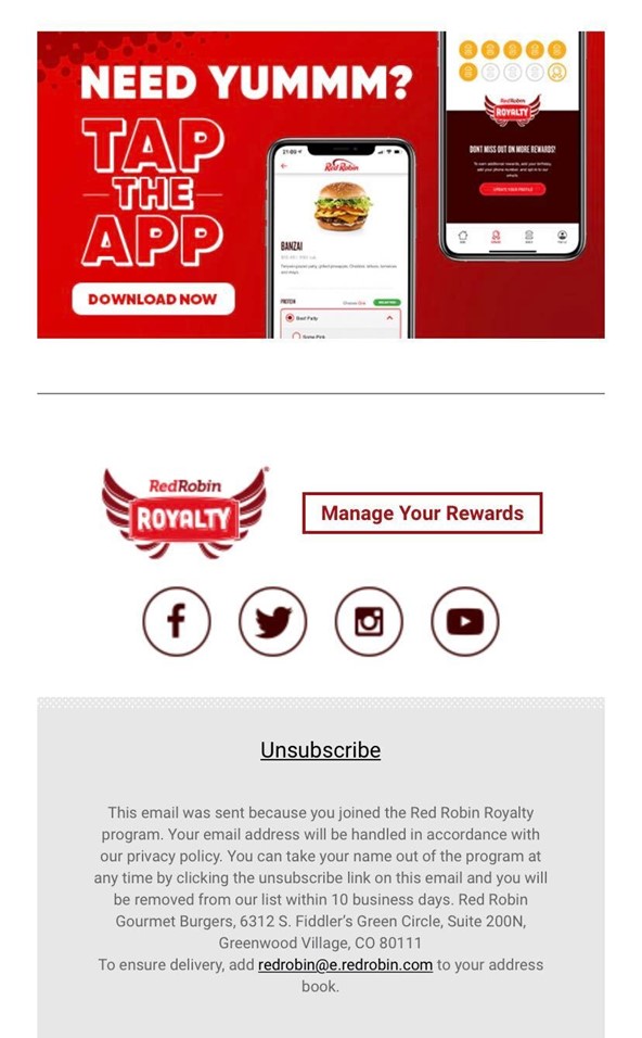
Unsubscribes are the last thing we want, but if your subscribers want to leave, don’t make it difficult for them. You don’t want to continue sending email to someone who isn’t interested in receiving it. This doesn’t help your case and can sometimes hurt your sending reputation instead. You may end up with complaints and get tossed in the spam folder which does not sit well with email providers.
Make your unsubscribe link easy to find and when you do come across your first opt-outs, don’t be afraid to turn it into its own opportunity to send a follow up message. Let them know you’re sorry to see them go, remind them of your value, and wish them well.
6. Personalize Where Appropriate

Personalization is becoming more and more popular and the best part is that it works (when used appropriately). Don’t go overboard and address a subscriber by their name every other sentence, but do take the extra step to build that personal connection.
There are a variety of ideas for incorporating personalization into your emails. It can be as straightforward as including their name in the subject line or in the greeting. Other brands seamlessly tie in personalization in other ways such as including points earned when linked to an account or sending follow-up tips on specific products that have been purchased.
7. Inspire FOMO
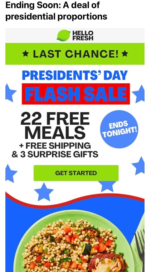
Some email correspondence requires a bit more energy and urgency than others. By this, we mean letting your subscribers know that whatever is going on, it’s not going to be around forever which is why it’s beneficial for them to act now. This is how companies get people into a buying frenzy during the holidays. You never know if the next deal or opportunity is going to be as good as the current one and there’s no guarantee it will come around again soon.
If you want your subscribers to take action, don’t be afraid to broadcast the limited window they have. Does the sale end tomorrow? Include a countdown. Are seats to the event filling up? Let them know exactly how many are left.
8. Segment Your List
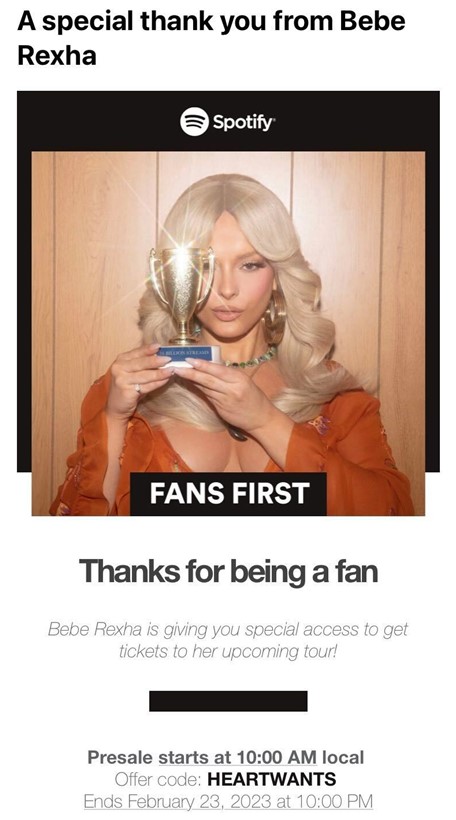
Segmenting your list is another way of targeting specific audiences and will give you a higher chance of conversions. This is one method of personalization because you’re grouping your subscribers into different categories based on factors like geography, interest level, loyalty tier, etc.
One example of this is offering different levels of discounts to different members based on past purchases. Lots of brands are known for having tiered reward levels with those who have spent the most in the past receiving better benefits like free gifts or larger discounts.
9. Be Your Own Guinea Pig
Send yourself or even your coworkers the first copy of any email. This gives you a chance to see exactly what it’s like to be on the receiving end. Does it look eye-catching? Are images loading properly? Do all of the links work like they should? Are there any glaring grammar or spelling mistakes?
By putting yourself in your subscribers’ shoes, you can evaluate what the experience is like from their perspective. Seeing your emails in real time in your own inbox can be the extra step you need to really perfect them.
10. Embellish with Visuals
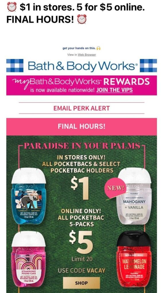
A block of text will only get you so far. Capturing the attention of your email subscribers is all about creating visually interesting content. There’s plenty of ways to break up information and make it so that every aspect of your email attracts attention. Give custom fonts, fun colors, memes, and exciting graphics a try. While you don’t want to overpack an email, just the right amount of balance between text and images can lead to a better experience for your readers.


