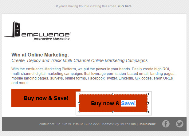
One of my favorite tricks in designing an email that still works when images are turned off, is the bulletproof button. You may have seen it in action — even if you didn’t know what it was. The bulletproof button is a button that shows up whether images are on or off, by using a single-cell table, a background color and a little CSS with the text link.
I’ve had quite a few people ask me how to make one, so I thought I’d post the 4-step how-to.
What goes into a great marketing email?
Download the anatomy of a marketing email template
How to create a bulletproof button in your email campaign:
1. Create a table that is 1 row x 1 column (total of 1 cell). Set the dimensions of the cell so it holds a button-like shape, i.e. 225×60 px.

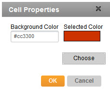
2. Select the background color for that cell to give your button its color.

3. Type your text call to action and style it however you’d like: centered in the cell, bold, larger font, etc.
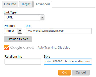
4. Make the text a link. You can change the color of your text link from blue to whatever hexadecimal code you want with a little CSS (code). You can also remove (or color) the underline with text-decoration: none;
TIP: Gmail won’t allow black links (they change back to default blue), so if you want black text, use #000001 for very, very dark grey.

That’s it! Preview it in as many inboxes as you can to be sure it works everywhere. Test especially well if the default link color won’t play well against your button color, e.g. blue button & blue hyperlink text.

Heads up: Cell padding and table height are ignored by Outlook 2007, 2010 & 2013, so your button will shrink up around your text. That may be ok, but you’ll want to check it out by testing it before you send!
Ready to get started?


