The out of the box configuration of the Account Entity in Microsoft Dynamics CRM has room for improvement when it comes to User Experience. From the seemingly random boxy layout of the Summary tab (and most of the tabs), to the abundance of seldom used fields, to the ever so slow loading timeline, things could be better.
A good user experience puts emphasis on critical and frequently used information and de-emphasizes less critical and less frequently used information. And while it’s not set up well for most organizations out of the box, the beauty of a CRM like Microsoft Dynamics is that we can customize it with relative ease. We did just that with our environment.
We focus on the Sales Hub in Microsoft Dynamics and our use of CRM is heavily weighted towards Sales and Marketing. With those Users in mind, we thought through how they could best leverage the existing CRM framework and then organized the data in a more meaningful way.
Let’s start at the top and work our way through the default layouts for the main Account Form.
Out of the box the Header for the Account Entity contains Account Name, a placeholder image for the Account, Annual Revenue, Number of Employees and Account Owner.

Since the Header stays with us the entire time we are in the Account Entity, there is probably a better use of that space. For most organizations only three of those fields need to be prominently displayed in a header area: Account Name, Account Image, and Account Owner. Annual Revenue and Number of Employees have value, but their value comes primarily from being a datapoint to include in a query for segmentation.
A much more useful set of data for our use case would include the Primary Contact Info the type of account and an active/inactive flag. Something like this:
![]()
Working our way down the main Account Form, we next get to the tabbed area. The addition of the tabbed interface in the new Unified Interface is a substantial improvement over the old scroll forever form layout. But here again the execution puts emphasis on field level data that just isn’t likely to be relevant on a daily activity basis unless your role is data entry.
As we look at how Sales and Marketing Professionals operate within our organization, we recognized a need for greater simplicity and organization of data. To get where we wanted to be, we created a new tab structure for the Account Entity.
The Ultimate Strategy Guide to Microsoft Dynamics and Marketing Automation
Learn how to integrate dynamics with your email, social, & more
Summary Tab
The default Summary tab represented one of the biggest areas for improvement. The summary should be a snapshot of the Account, a quick look at the most important information. For us, that includes the primary contacts, the services we provide, and any current opportunities.
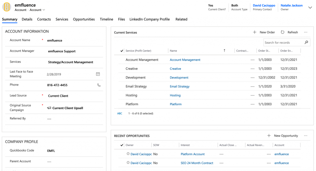
Our future state for this tab will include a stoplight function that adds a color coding indicator for the health of the account, a chart for historic billings, any outstanding support tickets and an account score percentile.
Details Tab
Our details tab is designed to be the data entry point for firmagraphic information, like company revenue, number of employees and industry. In addition, we store contact preferences, currency settings, and a variety of other datapoints that are seldom needed for day-to-day activities but may be useful for running queries for marketing or administrative reasons.
Contacts Tab
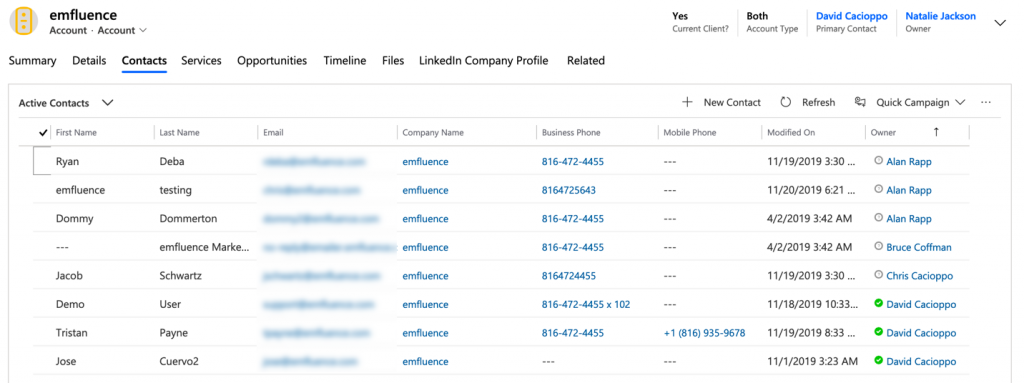
We’ve added a tab dedicated to the active Contacts for each Account. It’s a great way for our team to easily access the information about multiple individuals in an account and quickly communicate with them. Contacts can also easily be selected and added to Marketing Lists which then auto-sync to groups in the emfluence Marketing Platform to trigger automated campaigns.
Services Tab
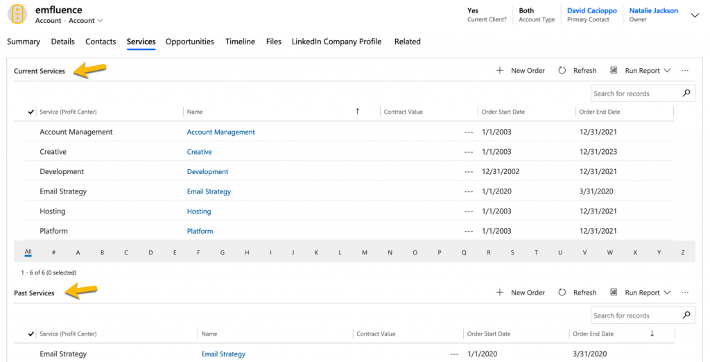
We have utilized the Orders entity in CRM to create a Services tab to our instance. This allows us to identify which of our core services an Account is actively leveraging or has historically leveraged. With this data easily accessible, we can quickly create cross-sell campaigns, identify reference accounts for new opportunities and identify potential testimonials for case studies and marketing materials.
Opportunities Tab
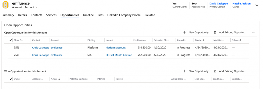
The Opportunities Tab is designed to give the Sales and Account Management teams a quick look at current open Opportunities and at past Opportunities for each Account. The teams can also quickly access the Quick Create function to create new Opportunities. (We’ve also customized the Quick Create form to include all the required fields for an Opportunity so there isn’t a need to bounce to the Opportunities entity.)
Timeline Tab
Because the Timeline is extremely slow loading, we have isolated it to its own tab. This prevents other tabs from loading slowly and also provides a better workspace to use the filtering functions. We find the ability to filter by specific Activity types useful especially when filtering by emfluence Emails. This quickly gives us an indication of the reach or our marketing emails to a particular Account.
Files Tab
Again, we have isolated specific content for a better user experience. We store contracts, NDAs, Statements of Work and other Account specific details here for easy access.
The end result of these customizations is an environment that works better for us and emphasizes the behaviors that our Users should do and want to do. What we have done works great for us and gives us a user experience that is intuitive and facilitates adoption, which is often difficult.
The relative ease of modifying Microsoft Dynamics CRM also means that things can be built in an iterative process or in sprints. By making improvements on an ongoing basis based on the feedback of our users, we are creating an environment they are comfortable in and therefore willing to adopt.
We continue to iterate and make our experience better. You should, too. Start by visiting with you stakeholders and understand:
- what they like
- what they don’t like
- what they would like to have but they don’t currently have.
These three categories of information will help you develop your roadmap to a better User Experience. Then, get in and get some early wins with simple customizations. As your Users see things take shape, they will become more active and provide better feedback.
Happy customizing!
