A few weeks ago, before our days were filled with online conference calls and setting up makeshift home offices, I had the opportunity to attend the UnSpam Conference hosted by Really Good Emails. The conference consisted of two days’ worth of fellow email geeks speaking about topics ranging from design trends, industry predictions, deliverability and more. It was a great opportunity to learn from others in the industry and come away with fresh ideas and new inspiration for all things email. One presentation in particular that really stuck with me was by Timothy Buck, co-host of the Accessible Podcast and Product Manager of Privacy at Facebook. Buck broke down the topic of accessibility in a way that really drove home its importance in today’s world, which is summarized below.

How many people actually need accessible email?
As email marketers, we know that accessibility is important, but it’s often placed on the back burner when creating an email. To help put the importance of this issue in perspective, it helps to understand just how many people report working with disabilities in their daily lives. According to the latest U.S. Census data, 57 million Americans report having some type of disability.
- 6 million people have a hearing impairment
- 1 million people have a vision impairment
- 2 million people have a cognitive or mental impairment
- Globally, over 2 billion people have a vision impairment or blindness (WHO)
Four Categories & How to Address Them in Email
There are four main categories of disabilities that we should address in email: Visual, Auditory, Cognitive and Motor. Each category requires its own set of guidelines to ensure emails are accessible and easy to understand, regardless of disabilities.
Visual
When we think of visual impairments, we automatically think of total blindness, but there is a much broader range, including color blindness, blurred vision and sensitivity to light. The tips below take different types of visual disabilities into consideration.
- Start with a clear hierarchy, and ensure you’re using semantic elements (such as header tags) in your code for anyone using assistive technologies to read the email. This will ensure the email is read in the order intended, or as close as possible.
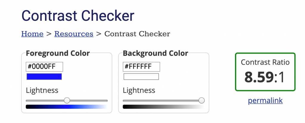
- Check contrast and sizing of design and copy
- Never use copy under 14px
- Enlist the help of a contrast checker tool, such as the one from org
- Don’t use color as the only way to communicate something
- Always use clear, descriptive alt text to describe images
- Make sure links are clear and easy to find
- Test different methods to find what works best for you and your audience

Auditory
While people with auditory disabilities are still able to read your emails, you should take this audience into consideration when you include elements like video or sound clips.
- Provide audio transcripts of videos. This can be done manually, or using online tools like Descript
- Include descriptive captions for videos that explain the main points
- Test different methods to find what works best for you and your audience
Cognitive
Those with cognitive disabilities should be able to understand your copy and its message clearly. This doesn’t mean you have to avoid complex topics; it just means you have to write about them in a way that the majority of your audience can understand, regardless of their education level.
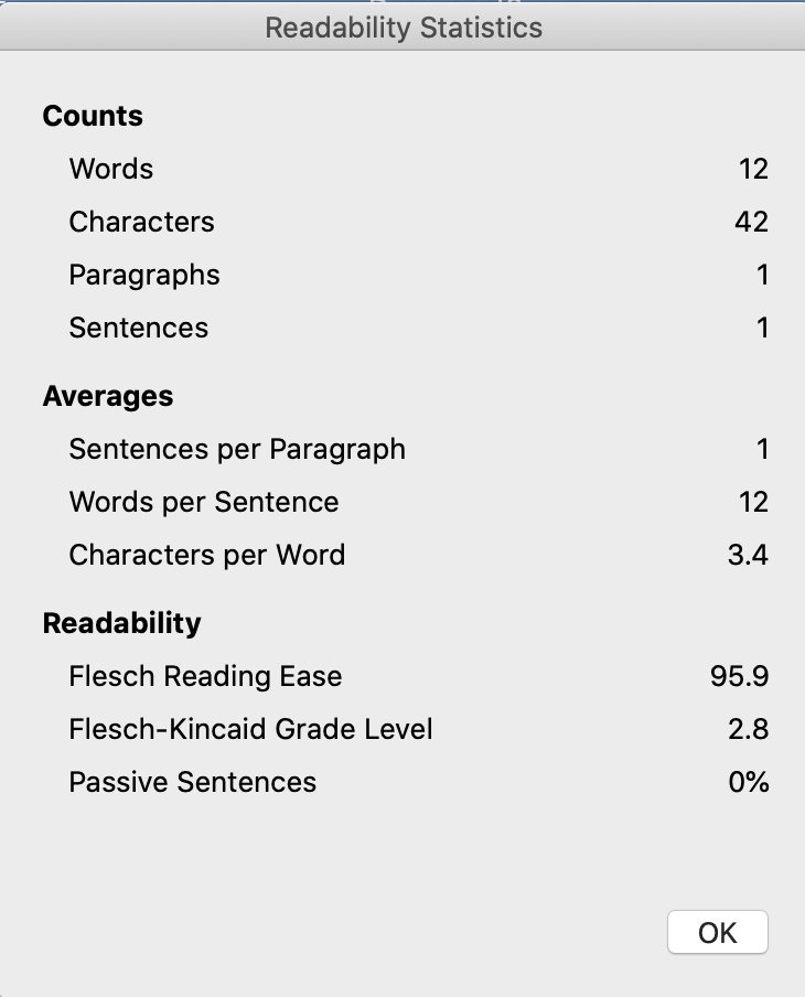
- Check reading level using tools such as the Flesch-Kincaid Reading Ease test on Microsoft Word, or using sites like readable.com
- Aiming for an 8th grade reading level or below is best practice
- Calls to action should be simple and specific
- For example, instead of, “Click Here,” consider “Click Here to View Products”
- Test different methods to find what works best for you and your audience

Motor
Individuals with motor impairments may have difficulty using their mouse with precision. In this case, you want to make sure you’re making it possible to click links or buttons within your email.
- Ensure CTA buttons and link tap areas are large and easy to click through
- Average size of a thumb is 44×44 pixels, so use that as a minimum height & width
- Give clickable areas enough padding
- 20 pixels is the standard minimum
- Test different methods to find what works best for you and your audience
Summary
Moral of the story: While it’s easy to let accessible design fall through the cracks, many of your subscribers rely on it to engage with your emails at all. Buck says, “designing for everyone, makes your email better for everyone.” So, test out different methods in your own emails to find out what works for both your audience and your brand. And when in doubt, consult with someone with a disability to get their feedback on how you can improve from their perspective.


